AWS Infrastructure Diagram: How to Plan and Build Clear Ones
 infrastructure governance. Teams that need a visual way to inspect infrastructure can also browse this infrastructure control panel for useful interface patterns.
Contents
- What an AWS Infrastructure Diagram Is Really For
- Picking the Right Diagram Type and Visual Hierarchy
- Building Multi-AZ, VPC, and Hybrid Layouts
- Adding Schedule and Cost-Optimization Layers
- Comparing Tools for Drawing and Exporting Diagrams
- Reusable Templates and Real-World Examples
- Keeping Diagrams Alive as Your Environment Grows
Ready to Slash Your AWS Costs?
Stop paying for idle resources. Server Scheduler automatically turns off your non-production servers when you're not using them.
What an AWS Infrastructure Diagram Is Really For
Most AWS diagrams fail in one of two ways. They freeze a moment in time and become stale, or they display every service until the page turns into a wall of icons. AWS itself defines architecture as “how components work together in a workload” and treats diagrams as a way to show communication and interaction across the six Well-Architected pillars, including security, reliability, cost optimization, and sustainability (AWS architecture guidance).
A useful diagram starts with reader jobs, not completeness.
- Locate workloads: Make the Region, Availability Zone, account, VPC, and subnet relationship obvious during onboarding or incident response.
- Explain dependencies: Show what calls what, in which direction, and across which trust boundary.
- Expose operating levers: Mark resources that can be scheduled, stopped, resized, or reviewed for ownership.
- Support decisions: Give security, reliability, and finance reviewers the view they need without forcing them through unrelated services.
Practical rule: If a reader can't name the affected account, network boundary, dependency, and lifecycle action quickly, the diagram is incomplete even when every icon is present.
AWS's reference architecture catalog reinforces this lifecycle view. Its diagrams include publication and update histories, and AWS describes them as vetted examples for building secure, resilient, high-performing, and efficient systems (AWS reference architecture documentation). Store the source file beside infrastructure code, record ownership, and update it when a material change lands. A diagram that reflects fewer resources accurately beats a broad diagram nobody trusts.
Picking the Right Diagram Type and Visual Hierarchy
One canvas shouldn't serve every conversation. Use sibling views instead. A logical topology diagram supports an architecture review, a network view supports firewall approval, a sequence view explains request behavior during an incident, and a cost overlay shows lifecycle and commitment decisions.
The nesting should remain consistent: AWS Cloud → Region → VPC → Subnet or Availability Zone → Service. Draw account and organizational boundaries around the relevant areas, not as decorative labels. AWS diagram guidance recommends explicit service names, CIDR blocks, ports, protocols, and external actors, while practical diagramming guidance suggests keeping an individual view to about 15–20 service icons and splitting larger systems into overview, network, and detail pages (AWS diagram guidance).
| Diagram Type | Best For | Key Annotations | Primary Audience |
|---|---|---|---|
| Logical topology | Architecture reviews | Services, dependencies, regions | Architects and developers |
| Network | Security sign-off | CIDRs, routes, ports, protocols | Network and security teams |
| Sequence | Incident analysis | Direction, retries, response paths | SRE and incident teams |
| Cost overlay | FinOps reviews | Lifecycle state, ownership, commitments | Finance and platform teams |
Use AWS Architecture Icons consistently. Generic boxes may be useful for business domains, but mixing visual languages makes readers slow down. Reserve color for state rather than product type: green for running, amber for scheduled stop, and red for a critical path. For deeper network conventions, the practical treatment of subnetting in IPv6 is a useful companion.
Building Multi-AZ, VPC, and Hybrid Layouts
Build from the outside in. Start with the Region boundary, then place Availability Zones as parallel columns. Redundancy becomes visible immediately, and an uneven service placement stands out before the diagram fills with application detail.
Reserve horizontal or vertical lanes for public, private, and isolated subnets in each Availability Zone. Put load balancers and ingress components at the edge, application services in the private lanes, and databases in the data lanes. Keep identical tiers aligned across zones so reviewers can compare placement without tracing a maze.
Place Transit Gateway in the center as the routing spine when multiple VPCs or hybrid connections are involved. Chained VPC peering may work for a small environment, but it becomes difficult to read and govern as account boundaries multiply. Label the relevant Transit Gateway route table, propagated CIDR ranges, and ASN behavior rather than drawing a generic cloud between networks.
Direct Connect, Site-to-Site VPN, and the customer gateway belong at the canvas edge. Their paths should terminate visibly at the Transit Gateway or inspection layer. Shared services deserve their own bounded area for centralized egress, inspection VPCs, Route 53 Resolver, and directory or DNS services.
Operational test: Trace a request from an external actor to the data tier, then trace a return path. If either route crosses an unlabeled boundary, redraw it.
Use orthogonal lines and consistent swim lanes for ingress, application, data, and egress. This structure also makes continuity assumptions easier to review, especially when documenting business continuity planning. The purpose isn't artistic symmetry. It's making routing, ownership, and failure domains legible when a second business unit arrives.
Adding Schedule and Cost-Optimization Layers
Topology tells you what exists. A cost layer tells you what should happen to it. AWS cost guidance emphasizes identifying services in use, measuring usage and expenditure, and continuously rightsizing or stopping idle resources, including under-utilized instances (AWS Cost Optimization Pillar).
Add lifecycle annotations after the topology is clean. Mark non-production databases, container services, and instances as stoppable when their schedules permit. Mark Auto Scaling groups, Aurora replicas, and similar components as resizable where capacity changes are safe. Identify batch pools that should follow a timetable, and distinguish production databases and load balancers that must remain available.
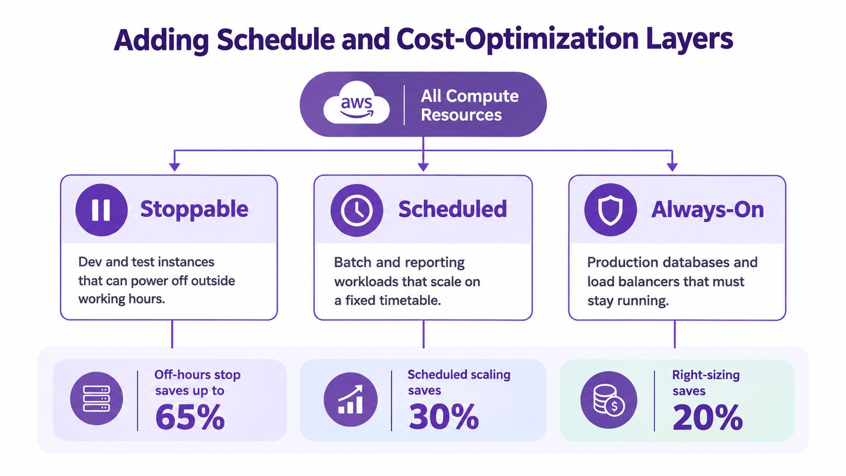
Each marker should map to an action. Use a tag such as ScheduleGroup, a Cost Allocation Tag, or an SSM maintenance window. Show Savings Plans and Reserved Instance coverage as account or workload overlays, and identify Spot capacity pools for interruptible batch processing. AWS's cost guidance also frames cost optimization as ongoing measurement, demand management, and resource selection (AWS cost optimization guidance).
This turns the diagram into a shared control surface. A finance partner sees ownership and commitment scope, an SRE sees operational risk, and a product owner sees why a non-production service powers down. For implementation ideas, see how to reduce AWS costs.
Comparing Tools for Drawing and Exporting Diagrams
Tool selection is really a source-of-truth decision. A beautiful diagram that drifts from Terraform is less useful than a plain diagram that updates with infrastructure changes.
| Tool | Best For | Source Of Truth Fit | Export |
|---|---|---|---|
| draw.io | Manual diagrams and lightweight collaboration | Moderate, if reviewed beside IaC | PNG, PDF, SVG, XML |
| Mermaid | Diagrams maintained by developers | Strong for text-based workflows, limited AWS fidelity | SVG, PNG through tooling |
| Lucidchart | Collaborative reviews and polished views | Moderate, unless refreshed from live data | PNG, PDF, SVG, embedded views |
| Cloudcraft | AWS-focused visual modeling | Moderate, with discovery features but review needed | Image and document exports |
| AWS Perspective | Account and resource discovery | Strong for live inventory, less control over layout | AWS-focused visual outputs |
| IaC-generated diagrams | Environments where code is authoritative | Strongest connection to deployed definitions | Depends on generator |
AWS-native tools can expose live infrastructure, but automatic discovery doesn't decide what a reviewer needs to see. Code-generated diagrams preserve declared relationships, yet they can be slow to refine and may omit runtime behavior. Generalist tools offer better layout control, but they rely on disciplined refreshes.
Pick the tool whose drift surface your team can manage. If Terraform pull requests are the reliable change record, generate a baseline from code and annotate operational state separately. If account discovery is the priority, use an AWS-aware tool, then curate audience-specific views before publishing.
Reusable Templates and Real-World Examples
Templates remove repetitive layout work, not engineering judgment. Keep a baseline three-tier web application, a multi-account landing zone, a Transit Gateway hub with shared services, a serverless event backend, a data lake, and a hybrid Direct Connect pattern with VPN failover.
Every template should include a legend, naming conventions, tag policy, and prefilled CIDR allocations. Store draw.io libraries, Lucidchart custom shapes, or generated source files in a templates repository. Give each template an owner and a short README explaining which assumptions must be replaced before review.
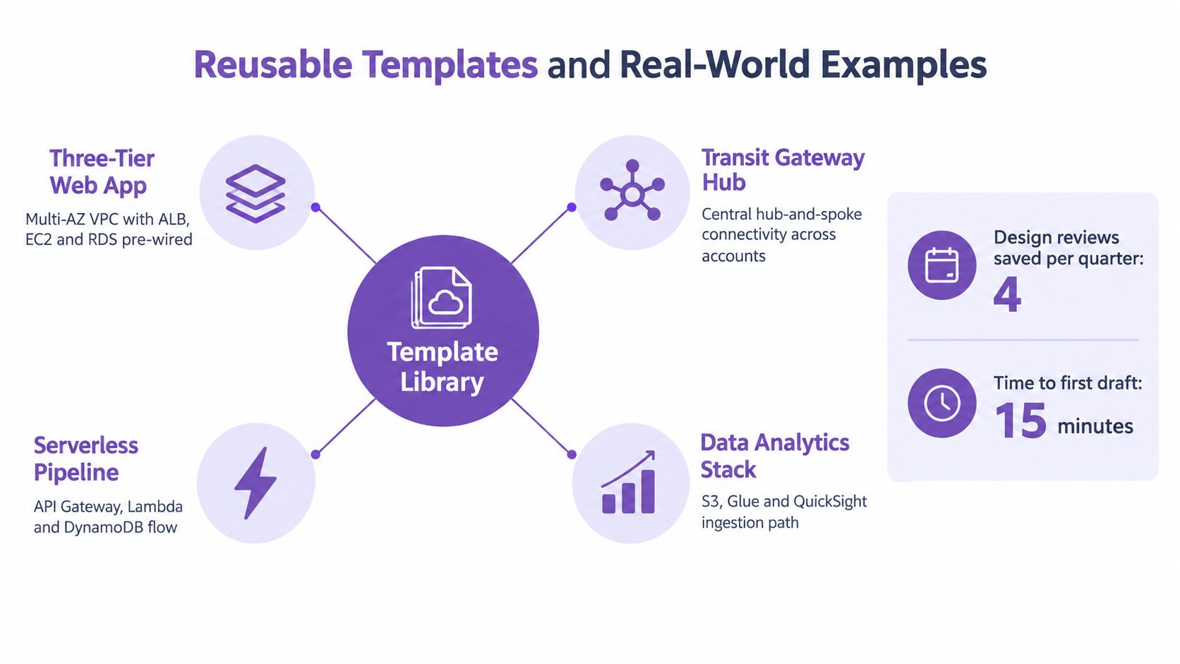
A production three-tier example should show why the load balancer spans the intended zones, which subnets host application capacity, and where databases sit relative to backup and failover paths. It should also make egress visible, because NAT gateway placement can affect both routing clarity and cost decisions. Avoid copying a reference architecture without validating ownership and operational behavior in your account.
The same principle applies to multi-account work. Shared DNS, centralized logging, cross-account IAM, and scheduling controls need explicit owners. A diagram that shows traffic but not policy enforcement leaves the hardest governance questions unanswered. Teams managing several environments can pair the visual model with guidance on managing multiple AWS accounts.
A short walkthrough can help reviewers understand why each boundary exists.
Keeping Diagrams Alive as Your Environment Grows
Treat the diagram like infrastructure-as-code. Version the source file beside Terraform or CloudFormation, assign one named owner for each network, account, and application tier, and keep a changelog beside the rendered output.
A practical maintenance rhythm has three parts:
- Change-triggered updates: Redraw when a pull request changes VPCs, Transit Gateway routes, peering, or shared services.
- Scheduled review: Compare the diagram with deployed resources during a quarterly architecture review.
- Drift handling: Treat unexplained differences as bugs, not harmless documentation gaps.
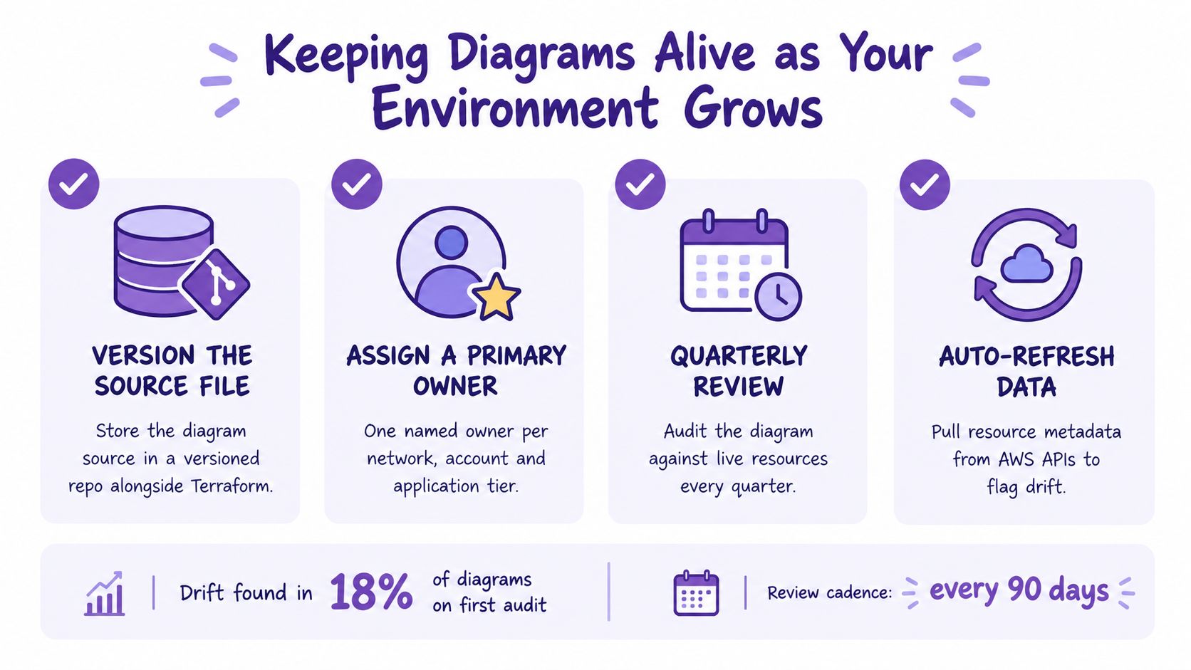
AWS's reference diagram catalog includes update histories and change subscriptions, a useful model for treating diagrams as maintained artifacts rather than finished illustrations (AWS reference diagram lifecycle). Keep separate overview, network, sequence, and cost views. Retire diagrams when nobody owns the system they describe.
Start with one account, one workload, and one lifecycle overlay. Confirm the diagram against live resources, publish the source file, name the owner, and attach the next review date. That small discipline is what lets an AWS infrastructure diagram survive staff turnover, audits, and the next redesign.
Related articles:
Server Scheduler helps teams turn lifecycle annotations into reliable start, stop, resize, and reboot schedules for AWS infrastructure. Visit Server Scheduler to connect operational intent from your diagram to predictable maintenance windows, without relying on scattered scripts or manual tasks.